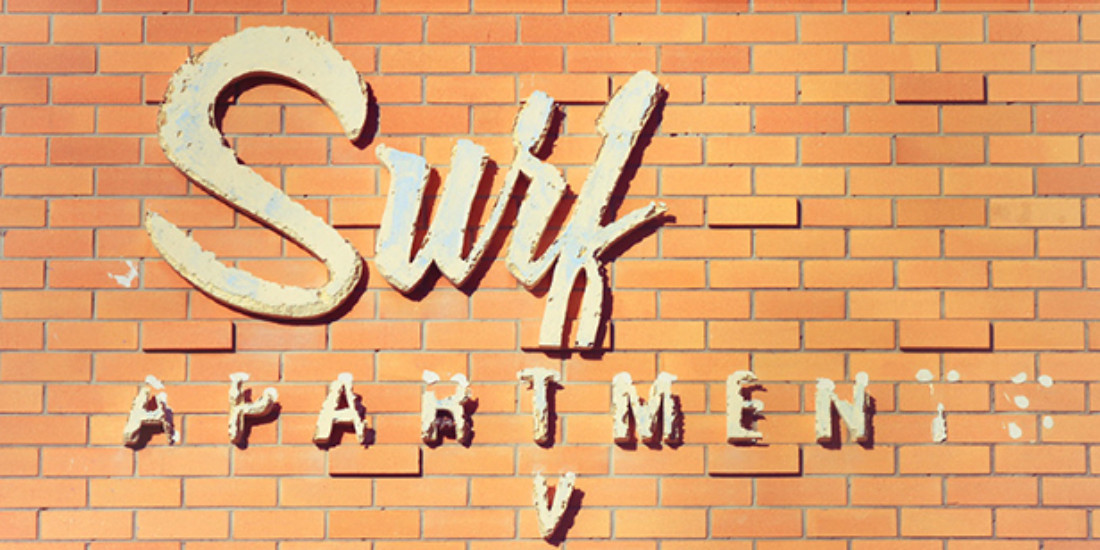
The Golden Sans Project tracks typography
The Gold Coast might get pigeonholed by its towering high-rises and glittering late-night digs, but let your eyes linger a little longer and you’ll discover there’s a lot more to our southern coastal neighbour.
A solitary letter dangling from a sun-bitten brick facade. Pastel plastic curves clinging to a weathered motel sign. Luminous type cutting into the night sky. These are the everyday details that may go unnoticed by the casual passerby, but they’re all precious fragments that comprise the unique cultural identity of the Gold Coast. That sexy shape-shifter may have reinvented herself many times over the past few decades, but the buildings and signage that dot her body bear witness to her past. The Golden Sans Project disrobes the city one iconic type-based sign at a time, peeling back the layers of history and documenting them in a visual anthology.
The project first began life as an informal Instagram blog, which saw freelance creative Andrew Suggit casually snapping residential and urban signage around his hometown. It’s since expanded into an intensive research mission, catching the sentimental hearts of locals and visitors, and offering a typographic-porn fix for the graphic design groupie. A series of framed prints and a coffee table book are due to be released before the end of the year, with a full exhibition planned for February 2014. Cast an eyeball over the website for weekly releases and check out the video online.

